Field Service Analytics: The Metrics That Actually Matter

Most field service operations measure their engineers to three decimal places and their customers barely at all. The scheduling engine reports utilisation by the minute; the contact centre logs call volume by the thousand. Yet ask how many of those calls were avoidable, a customer ringing only to ask where the engineer was, and the dashboard usually goes quiet. That silence is where a lot of avoidable cost hides.
Quick answer: Field service analytics is the practice of turning field-operations data — jobs, visits, schedules, contacts and customer feedback — into decisions. The metrics that matter split into three: operational (first-time fix, utilisation), financial (cost per visit) and customer-side (engagement, call deflection, real-time NPS). Most teams measure the first two well and the third hardly at all.
Why field service analytics matter
Field service analytics matter because field work is expensive, dispersed and hard to see, and what you can’t see, you can’t improve. Analytics is how an operation running engineers across a region keeps a grip on cost, productivity and customer experience without standing over every job.
The stakes are rising with the market. Field service management software is forecast to grow from $5.10 billion in 2025 to $9.17 billion by 2030, a 12.5% compound annual growth rate (MarketsandMarkets, 2025). That spend buys scheduling engines, route optimisation and mobile tools, all of which generate data. The operations that pull ahead are not the ones with the most data; they are the ones measuring the right things and acting on them. A modern operation has no shortage of metrics. It has a shortage of the useful ones, surfaced quickly enough to change a decision while it still matters.
For enterprise operations of 200 to 1,000-plus technicians and tens of thousands of appointments a month, a single point of first-time fix, a few percentage points of utilisation or a slice of avoidable call volume is, at scale, a large number. The discipline is knowing which to watch.
The KPIs that actually matter
The metrics that actually matter are a short list, not a long one. Five carry most of the weight: first-time fix rate, no-show rate, technician utilisation, engagement rate and call deflection. Track these well and the rest tend to fall into line.
First-time fix rate
First-time fix rate (FTFR) is the share of jobs resolved on the first visit, with no return needed. It is the most-watched number in field service, and rightly so, because a failed first visit is expensive twice over. According to Aquant’s 2024 Field Service Benchmark, the average first-time fix rate is 76%, with top performers reaching 87% and the bottom sitting at 55%. That spread is the whole story: the gap between a strong operation and a weak one is more than thirty points, and almost all of it comes down to getting the right person, parts and information to the job first time. The cost of getting it wrong compounds: a failed visit leads to 2.7 total visits on average and adds 13 days to resolution (Aquant, 2024). For a fuller treatment, see our guide to improving first-time fix rate.
No-show rate
The no-show rate is the proportion of appointments where the customer isn’t there: a technician’s time spent travelling to a closed door. It is pure waste, and it is heavily driven by communication. Most no-shows are not customers who didn’t care; they are customers who forgot, or couldn’t make the window and had no simple way to change it. That makes no-show rate one of the most movable metrics on the board, because the fix, reminders and easy self-service rescheduling, is cheap and fast.
Technician utilisation
Technician utilisation is the proportion of a technician’s paid time spent on productive work rather than travelling, waiting or sitting idle. Better scheduling and routing lift it directly. So, indirectly, does anything that cuts failed and repeat visits, because every return trip eats capacity that could have served a new customer. Utilisation is where the operational savings live, but read it alongside first-time fix, or you risk packing the schedule so tightly that quality slips and rework climbs.
Engagement rate
Engagement rate is the share of customers who actually open, view and use the communications and self-service tools you send: the tracking link, the confirmation, the rebooking page. Most dashboards stop short of measuring it. Engagement is the leading indicator for everything downstream: a customer who is engaged is a customer who reschedules online instead of phoning, who is home when the engineer arrives, who leaves feedback. Low engagement is an early warning that the avoidable calls are coming.
Call deflection
Call deflection is the reduction in inbound contact-centre volume achieved by answering the customer’s question before they need to ask it. It is the clearest financial read on customer-side performance, because every deflected “where’s my engineer?” call is a cost removed and a customer reassured at the same time. It deserves a careful definition, one the industry routinely muddles. A typical self-service deployment cuts appointment-related calls in the 40–55% range within the first months. Some operations do better; one result below reached 53%. None of that is the same as a guarantee.

Operational, customer-experience and financial metrics
Field service metrics sort cleanly into three families, and the most common analytics failure is watching one family and ignoring the others. A balanced field service dashboard reads across all three.

Operational metrics measure the work: first-time fix rate, technician utilisation, mean time to repair, jobs completed per day, SLA compliance. These are the numbers most operations already track well, because they fall straight out of the scheduling and work-order systems. They tell you how efficiently the operation runs.
Customer-experience metrics measure how the service feels from the other side of the door: engagement rate, real-time NPS, customer effort, complaint volume, no-show rate. These have to be captured deliberately, at the moment of the appointment, rather than pulled from the WFM, which is why most operations track them least well.
Financial metrics translate the other two into money: cost per visit, cost per call, revenue per technician, the cost of a repeat visit. Call deflection sits at the seam between customer experience and finance: a customer-side improvement with a directly measurable cost saving, which is exactly why it is the metric to lead with when you are making the case to a CFO.
The point of the three-family split is correlation. An operation with strong operational numbers and weak customer-experience numbers can be running a flawless schedule that still produces anxious customers and a flood of avoidable calls. You only see it if you measure both.
Real-time versus retrospective analytics
The second axis that matters is timing, and most field service analytics are still looking firmly in the rear-view mirror. Retrospective analytics tell you what happened last month; real-time analytics tell you what is happening now, while you can still do something about it.
Retrospective reporting has its place. Monthly first-time fix trends, quarterly utilisation, year-on-year cost per visit are how you spot drift and prove improvement. But a report that arrives three weeks after the event can only inform the next period; it can’t save the job that is going wrong today.
Real-time analytics change the job from post-mortem to intervention. A live read on which appointments are running late lets the contact centre get ahead of the calls. Real-time NPS, feedback captured in the minutes after the visit rather than in a survey weeks later, catches a dissatisfied customer while recovery is still possible and the detail still accurate. The shift from retrospective to real-time is one of the biggest upgrades most operations can make to their analytics, because it moves the data from explaining outcomes to changing them. Capturing feedback at the moment of the appointment is the heart of measuring customer satisfaction in field service.
The metrics most teams miss
The metrics most teams miss are the ones their customers care about most. Operational dashboards are mature; customer-side measurement, in most enterprise operations, is close to absent, and that gap hides the single largest pool of avoidable cost in field service.
Consider the data on appointment change. On My Way’s internal research finds that a third to 40% of appointments are amended by the customer and a further one in ten cancelled, with each amendment running a five-to-seven-minute contact-centre call, usually placed after hours. That is not a rounding error. For an operation handling tens of thousands of appointments a month, it is a standing wave of contact-centre volume that barely registers on a conventional FSM dashboard, because the dashboard was built to measure engineers, not customers.
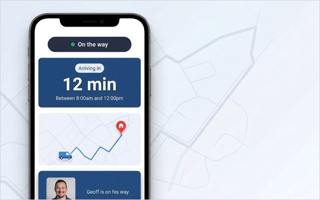
This is the appointment problem. The operation can tell you its first-time fix rate to one decimal place; it usually cannot tell you what proportion of inbound calls were customers simply trying to change or check an appointment, work they would happily have done themselves, given a way to. The fix is to start measuring three things almost nobody does: engagement rate (are customers using the self-service tools?), call deflection by reason code (which calls disappeared, and why?), and real-time NPS (how did the appointment actually feel?). For how that capture works in practice, see field service analytics in the product and real-time customer feedback.
53% — Bosch UK, a 350-engineer UK enterprise HVAC operation handling around 1,100 appointments a day, cut ETA-related calls by 53% and reached 79% customer engagement after adding live tracking and self-service on top of its existing WFM. The calls fell because the questions were answered before they were asked.
The mechanism repeats across operations. E.ON improved appointment-based first-time job completion by 19% by getting the right information to the engineer before arrival. Brinks Home cut ETA calls by 34% and improved appointment-based first-time job completion by 25%. Different verticals, same lesson: once the customer-side numbers are measured and acted on, the operational and financial ones tend to follow. Closing this gap doesn’t require ripping out the WFM. The data already exists in the appointment flow; it is a question of adding the layer that captures and acts on it.
Building a field service dashboard
A field service dashboard works when it tells an operator what to do next, not just what already happened. The aim is a single view that balances the three metric families and separates the real-time from the retrospective, not a wall of forty charts nobody reads.
A practical build looks like this. Lead with the operational core: first-time fix rate, technician utilisation, jobs completed, SLA compliance, trended over time so drift is visible. Add the customer-side panel most dashboards omit: engagement rate, call deflection by reason code, no-show rate and real-time NPS, side by side with the operational numbers so the correlation is impossible to miss. Then a financial summary that converts both into cost per visit, cost per call and revenue per technician.
Two design rules separate a useful dashboard from a decorative one. First, segment by reason code, especially on contact volume: an undifferentiated “calls per day” figure hides the entire appointment problem, whereas “ETA enquiries / rescheduling / post-visit / other” exposes it instantly. Second, distinguish live from historic on the face of the dashboard, so an operator knows at a glance which numbers they can still act on today and which are there to inform next month’s plan. The underlying data spans systems, scheduling from the WFM, contact data from the contact centre, feedback from the customer layer, which is why the dashboard sits best on top of, not inside, any single platform. It pulls from the work-order and appointment record and the customer-communication layer alike.
Getting started
Start by measuring the gap before you try to close it. The fastest, cheapest first move in field service analytics is not a new platform; it is two weeks of honest measurement of the numbers you currently ignore.
Run a fortnight of tagged inbound contact: every call coded by reason, ETA enquiry, rescheduling, cancellation, post-appointment, other. Almost every operation that does this is surprised by how much of the volume is avoidable, and the tagging turns the appointment problem from a hunch into a board-ready number. In parallel, baseline the operational three, first-time fix, no-show rate and utilisation, so you have a before-picture. Then add the customer-side metrics you’ve been missing, engagement, call deflection and real-time NPS, and watch how they correlate with the operational ones. The model that closes the gap is additive, not disruptive: a customer-communication and self-service layer on top of the WFM you already run captures the data and removes the avoidable calls in the same motion, which is the field service management pattern most enterprise operations are moving toward.
See where your calls are really coming from. Most operations are surprised how much contact-centre volume is just “where’s my engineer?” On My Way deflects those calls with live tracking and self-service, on top of your existing WFM, and gives you the engagement, deflection and real-time NPS numbers your current dashboard can’t. Book a 30-minute working session and we’ll map it to your data.
Frequently asked questions
What are the most important field service KPIs?
The five that carry most of the weight are first-time fix rate, no-show rate, technician utilisation, customer engagement rate and call deflection. The first three are operational and most operations measure them well; the last two are customer-side and most measure them poorly. A balanced view also tracks cost per visit, mean time to repair, SLA compliance and real-time NPS — but if you fix the core five, the rest tend to follow.
What is a good first-time fix rate?
The average first-time fix rate is around 76%, with top performers reaching 87% and the weakest operations sitting near 55% (Aquant, 2024). A figure in the low-to-mid 80s is strong; anything below the low 70s signals a real cost problem, because a failed first visit leads to 2.7 total visits on average and adds 13 days to resolution. The gap between the best and worst is more than thirty points, almost all of it down to getting the right engineer, parts and information to the job first time.
What is call deflection in field service?
Call deflection is the reduction in inbound contact-centre volume achieved by answering the customer’s question — usually “where’s my engineer?” or “can I move my appointment?” — before they need to phone. It is measured as the drop in appointment-related calls after self-service and proactive communication are introduced. A typical deployment cuts those calls by 40–55% within the first months. That is distinct from a performance guarantee: On My Way underwrites a 35% reduction in appointment-related calls within 90 days, while typical results run higher.
How is field service analytics different from a field service dashboard?
Field service analytics is the broader practice of turning operational data into decisions; a field service dashboard is the tool that surfaces it. Analytics includes the retrospective analysis (monthly trends, year-on-year comparisons) and the real-time intervention (acting on a job running late today); the dashboard is where both become visible to an operator. A good dashboard balances operational, customer-experience and financial metrics and separates live numbers from historic ones.
Which customer-side metrics should field service operations track?
Three that most operations don’t: engagement rate (the share of customers actually using your tracking and self-service tools), call deflection by reason code (which calls disappeared and why), and real-time NPS (feedback captured in the minutes after the visit rather than weeks later). These are the leading indicators for cost and satisfaction, and they are the blind spot in most field service analytics because they have to be captured deliberately at the appointment, not pulled from the WFM.

The bottom line
Field service analytics is a short list of the right metrics, surfaced fast enough to change a decision, not a long list surfaced too late to matter. The operational numbers are usually well-served already; engagement, call deflection and real-time NPS are the ones most operations leave unwatched, and they are where the avoidable cost hides. Measure them, correlate them with the operational metrics, and the case for closing the gap makes itself.
References
- MarketsandMarkets — Field Service Management Market (market size and CAGR), 2024
- Aquant — 2024 Field Service Benchmark Report (first-time fix rate, repeat-visit and resolution-time data), 2024
- On My Way / Leadent Digital — internal deployment research (appointment-change volume and contact-centre impact), 2024.

Keep your WFM. Upgrade what your customers experience.
On My Way is the customer-experience layer for field service: live arrival tracking, self-service rebooking, notes and photos, and feedback — added on top of the scheduling system you already run. No rip-and-replace, live in 4–6 weeks.